“You can’t depend on your eyes when your imagination is out of focus.” – Mark Twain
The winter months have faded to the past, making way for new ideas and creativity in 2017. The paint industry has started a year of innovation with each manufacturer featuring their new Color of the Year. The days of white and grays are being replaced with sophisticated hues and dusky colors. Just as the Spring brings back color and life, let this list be a springboard when picking your newest colors in an upcoming paint project.
Let’s have a look at the trending colors of 2017…
GREENERY – Pantone
Pantone, the world’s leader in colors, is featuring Greenery, a refreshing and invigorating shade which symbolizes new beginnings. Greenery is a fresh and peppy yellow-green shade that elicits the first days of spring, when nature is reviving after its winter hibernation. It is the perfect color to welcome Spring in 2017. It can be paired with a multitude of other colors, including whites, neutrals, brights and deeper shades.

SHADOW – Benjamin Moore
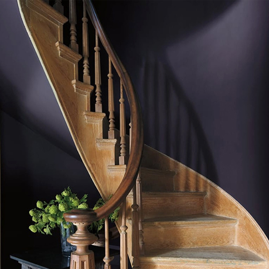
Benjamin Moore’s Shadow is a deep purple gray hue that is a “master of ambiance” in the eyes of Ellen O’Neill, Benjamin Moore’s Creative Director. It is a color reminiscent of a past era, yet still relevant in a contemporary setting. Use it in small doses, particularly in stairways, as it adds a flair of the dramatic without encroaching on everyone’s morale. Shadow can be paired easiest with neutral colors but Benjamin Moore’s Spring Valley, Cotton Tail and Truffle are great matches.
POISED TAUPE – Sherwin Williams
Sherwin William’s choice for its 2017 Color of the Year is the perfect balance between warm and cool. Poised Taupe, a cool medium brown, brings an element of class and refinement to every angle. It is best paired with Sherwin Williams’ Cottage White or Pearl White and can be used in any area to add a touch of elegance.

WANDERLUST – Behr
Each year, Behr creates around 20 new hues to determine its color of the year. In 2017, they focused on creating a palette that reflects peoples’ desire to create a home which is “uniquely theirs”. Wanderlust is a rich teal shade which creates a calming environment, instilling confidence and trust within your family or group. It can be paired with whites, grays and other neutrals and is best used in a living room or other family area.

BYZANTINE BLUE – Glidden
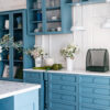
Glidden’s 2017 Color of the Year, Byzantine Blue, may claim to be blue, but actually has a hint of purple in disguise. Recalling the regal beginnings of an ancient civilization, this mystic blue-purple adds the perfect touch to kitchens, living rooms, bathrooms and even bedrooms. When paired with dark neutrals, it shifts its appearance towards the gray spectrum, but when partnered with whites, it will appear more bluish-purple. Byzantine Blue looks its best with Glidden’s Deep Onyx, Stone Harbor Greige and Canyon Echo.

KETTLEMAN – Kelly-Moore
This is the perfect pick for those who still prefer a neutral palette. For its 2017 Color of the Year, Kelly-Moore has selected Kettleman, a dark gray with a touch of warmth. Similar to other 2017 colors, it’s a deep and rich hue and should be used in smaller doses or contrasted with plenty of lighter colors.

HONEY GLOW – Dunn Edwards
If you’re looking for a burst of evening sun amid, the cooler, moodier hues, you will love Dunn Edwards’ 2017 Color of the Year, Honey Glow. It is a warm, golden yellow with orange undertones which will make a bold statement in any space. Honey Glow re-energizes your room with its happy and welcoming cheer and will create the perfect accent wall in your living room. Honey Glow is best when paired with darker hues of gray and green.

Let spring fever take hold and benefit from this time of year of new ideas and innovation to get the perfect paint color for your home. Don’t hesitate to contact Precision Painting Plus, New York’s #1 Rated Painting Company, for your next project, and take advantage of our exciting spring offers.
Get A Free Estimate
2 Year Warranty - Competitive Price Matching


