Kitchens can be a challenging room to choose paint for. Not only do you have to find the right color that blends with the rest of your home, but you also have to consider durability and stain resistance.
But fear not! Our experts are here to help sort through the hundreds of paint colors that could fit your kitchen. We’ve selected our six favorite colors for kitchens and shared some tips on other important factors to consider when choosing the best and most durable paint for one of the most important rooms in the home.
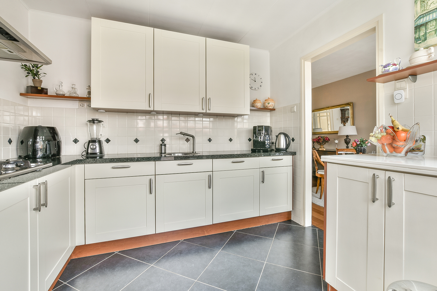
1. Benjamin Moore’s Silver Satin
Silver Satin is a soft and neutral gray with a gentle silver hue that looks elegant and cool. It’s part of the Off-White Collection and one of Benjamin Moore’s best sellers.
As a neutral color, it goes well with many trim and cabinetry color combinations, allowing you to experiment with various color palettes for your kitchen. If you want to keep things simple, use Benjamin Moore’s Chantilly Lace as a clean white for your trims and a crisp white like Super White or a light gray like Classic Gray for your cabinets.
While you have many options to combine trims, cabinets, and decor, remember that Silver Satin generally looks best in brighter rooms. If your kitchen needs a bit more brightness, it might look a touch dingy.
2. Benjamin Moore’s Philadelphia Cream
Philadelphia Cream is inspired by classic architectural styles from Philadelphia’s history, coming off as a creamy, light, and warm yellow that will give your kitchen a peachy look. This makes it inviting without sacrificing its sense of elegance and sophistication.
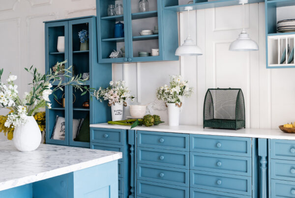
For your trims, you could go with White Dove, an off-white with warm undertones, or Hawthorne Yellow if you want to make them pop against the creamy background. You could keep your cabinets simple with a shade of white or go for a striking contrast with a blue like Waterdrop.
With a light reflectance value (LRV) of 69.12, Philadelphia Cream can brighten up your kitchen, depending on how you play with natural and artificial lighting.
3. Benjamin Moore’s Pashmina
Inspired by elegant Kashmir wool, Pashmina adds sophistication to your kitchen. It’s a warm taupe with undertones of brown and gray with a fairly low LRV of 44.2, making it one of the darkest on this list.
As a warm color, Pashmina excels at giving your kitchen a welcoming and cozy look. However, this color also has a bit of coolness from its gray undertones, making it fairly versatile. That’s why there’s a wide range of accent, trim, and cabinetry colors you can mix with.
From brighter tan and beige options like Manchester Tan and Feather Down to gray-green blends like Saybrook Sage and Palladian Blue, Pashmina lets you play with various styles and complementaries.
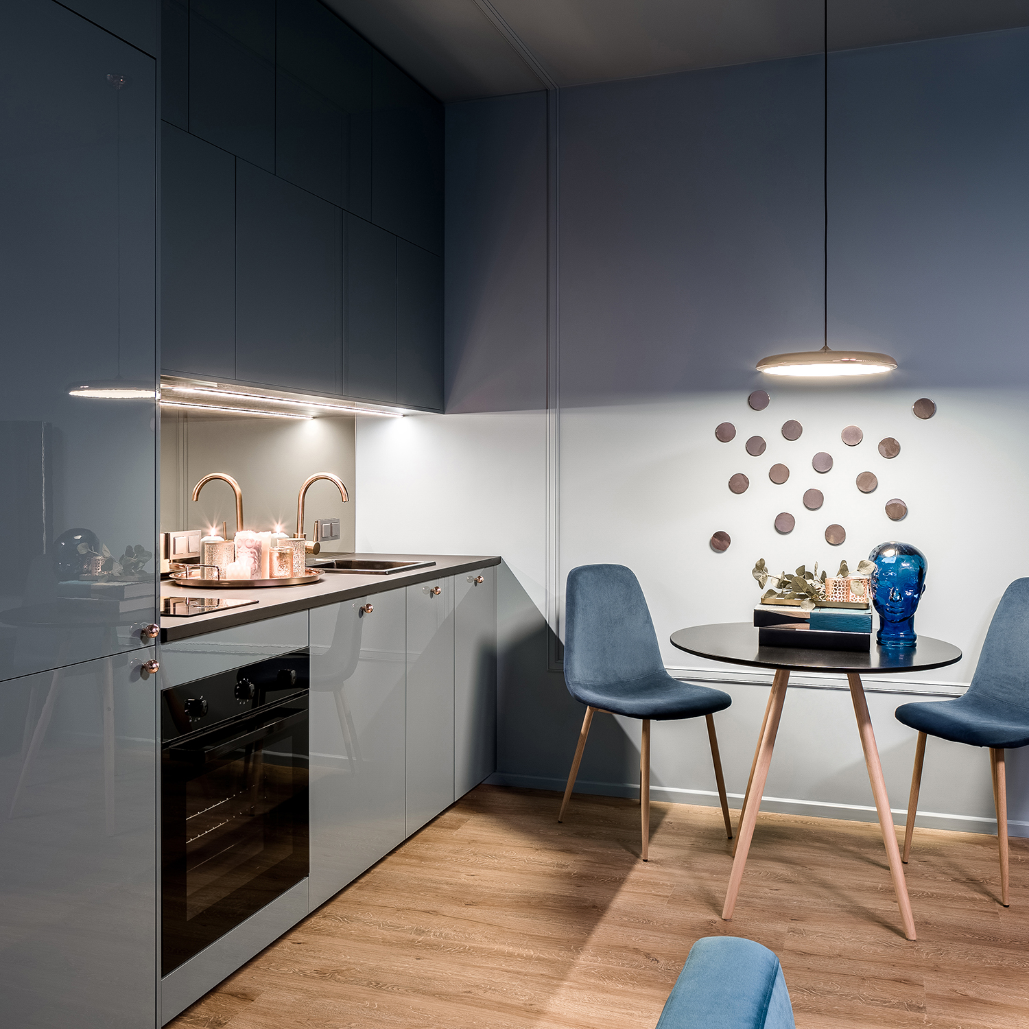
4. Benjamin Moore’s Hale Navy
Navy blue is probably not most people’s first option when choosing their kitchen’s new color, but you can always make it work. Standing as the darkest color on this list with an LRV of 8.36, Hale Navy is a deep, classic navy blue with no warm undertones and the ability to maintain a blue hue regardless of the lighting conditions. It brings elegance and amazing depth to your kitchen.
Being so deep, you’ll generally want to pair it with lighter colors for your trims and cabinets. Two great options include Chantilly Lace and White Dove if you want timeless, contrasting elegance. But you can also pair it with a greige like Revere Pewter.
Finally, you can consider some cream tones like Ballet White. Just be mindful of using a tone that isn’t too yellow, as it might not blend well with such a deep blue.
5. Benjamin Moore’s Woodlawn Blue
Woodlawn Blue is a refined blue-green paint color part of the Historical Collection. Depending on your kitchen’s lighting, it may lean more towards blue or green but will still provide enough serenity for your kitchen with its pleasant undertones and a hint of gray to keep it muted yet lively.
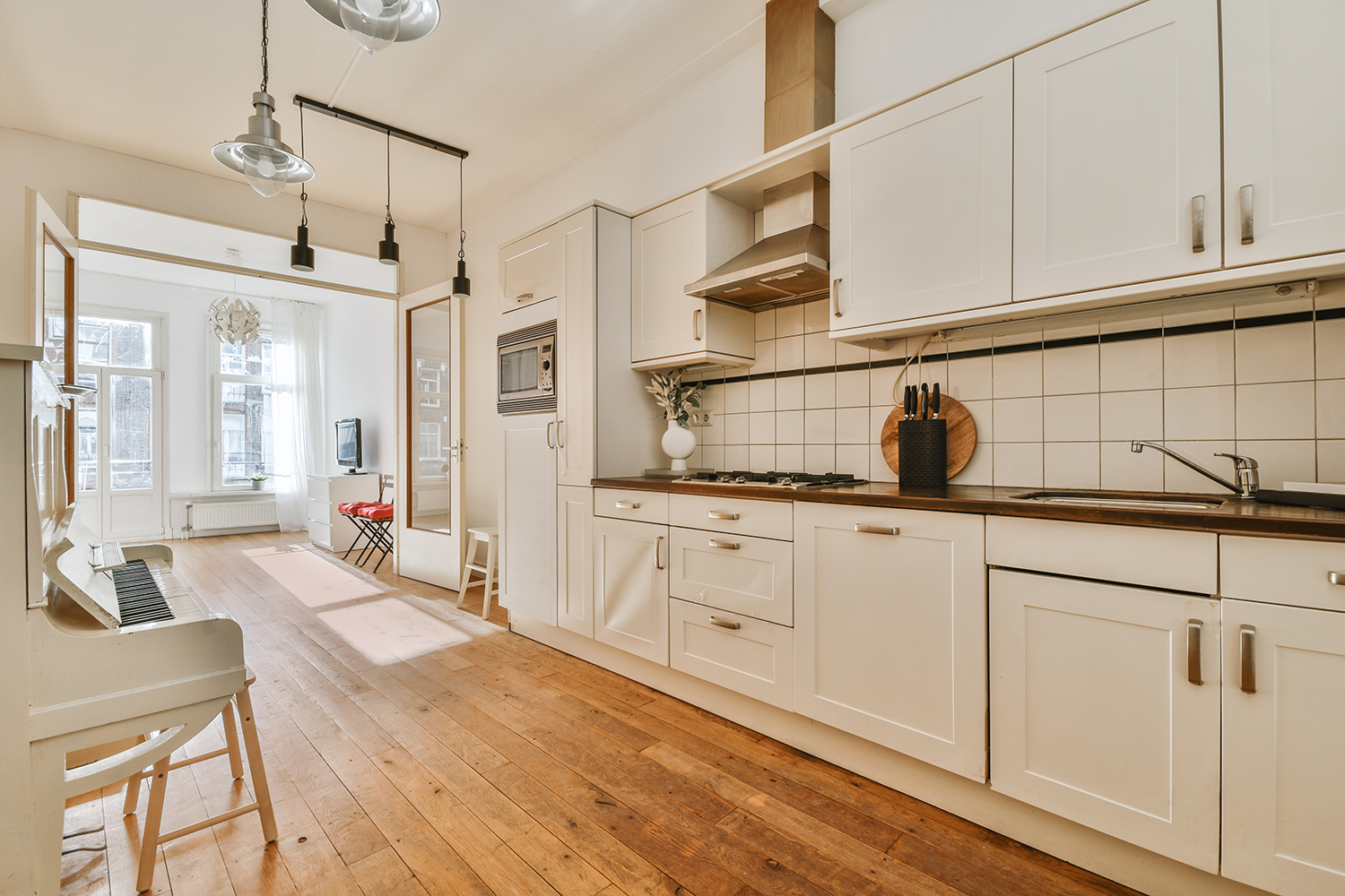
Under a lot of natural lighting, Woodlawn Blue may appear a bit pale and give any kitchen a beautiful, welcoming appearance, especially when paired with light wood or hardwood floors.
Like other blues, it pairs well with many colors. If you want to mix your Woodlawn Blue with white, go for Chantilly Lace. Or go for Polo Blue if you want a striking but balanced color palette. Finally, a cream like Natural Cream will make your kitchen warmer and more inviting.
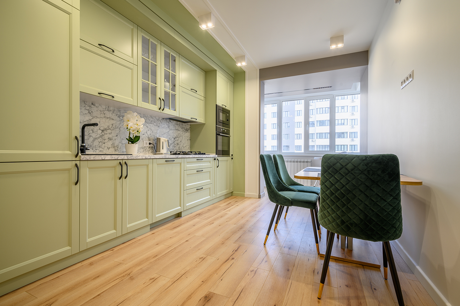
6. Benjamin Moore’s Fernwood Green
This leafy green that comes as a shade of beige or a pale yellow pours calmness into kitchens with its softness and warmth. Its subtle earthy quality serves as an excellent background for your kitchen.
With an LRV of 56.76, it’s a bit darker but finds a good middle ground between reflectiveness and pigmentation.
Fernwood Green looks impressive when combined with white trims and cabinets. Mixing it with an off-white like White Dove provides a clean-looking combination. But you can try some grays, too! Classic Gray and Gray Cashmere pop against a Fernwood Green background.
What to Look For in Kitchen Paint?
Even after you decide on a color, you should consider the following factors when choosing paint for your kitchen.
- Moisture and stain resilience. Look for paints that resist the moisture and stain kitchen walls are prone to receive. Focus on labels like “kitchen and bath” or “moisture-resistant.”
- Ease of cleaning and scrubbing. Your kitchen paint should resist scrubbing so you can clean it without worsening things.
- Durability. Due to the high traffic and wear and tear, you should repaint your kitchen every 5-7 years, so go only for durable options.
- Sheen. High-gloss and semi-gloss paint is easier to clean but may show imperfections a bit more. Depending on your preferences, satin and eggshell sheens may offer a better balance.
- VOCs. Go only for kitchens low on volatile organic compounds to prevent unpleasant and potentially toxic fumes.
Considering these factors, you’ll find the perfect paint for your kitchen in no time! Explore options, order samples, and test them until you find the perfect one.
